
 by
by Continuing with the Trends section, this article will highlight the latest trends in push advertising for affiliate marketing. There are just a few details you need to pay attention to and your creatives will convert successfully.
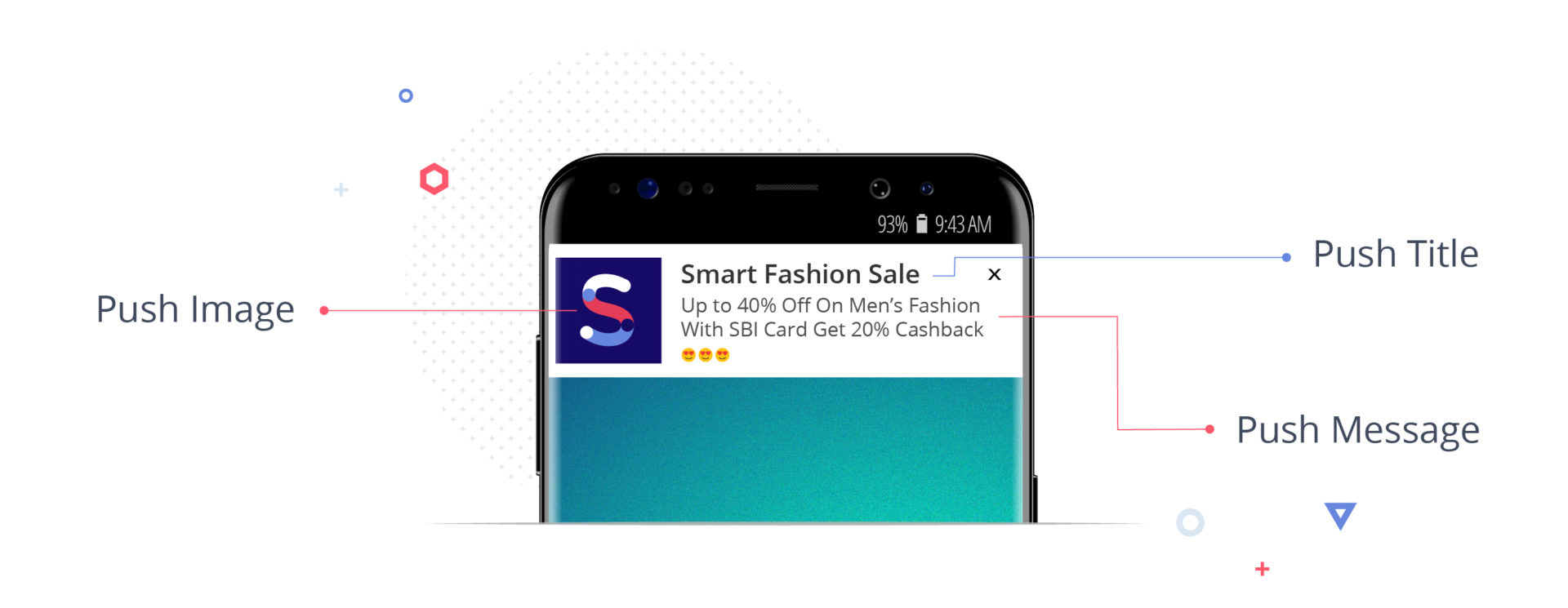
As a reminder, push ads are a type of native ad format. Whether notification is displayed on a mobile device or on a desktop console, it consists of three elements: an image, a title, and a description. And each of these elements is important.
The main advantage of this ad format over others is that push notifications are sent to users who have subscribed to your newsletter. This means that the audience is already interested in what will be in this ad.
Therefore, it should come as no surprise that push ads often have higher conversion rates. The aim is to increase it to higher levels, follow the trends and make creatives that users best respond to.
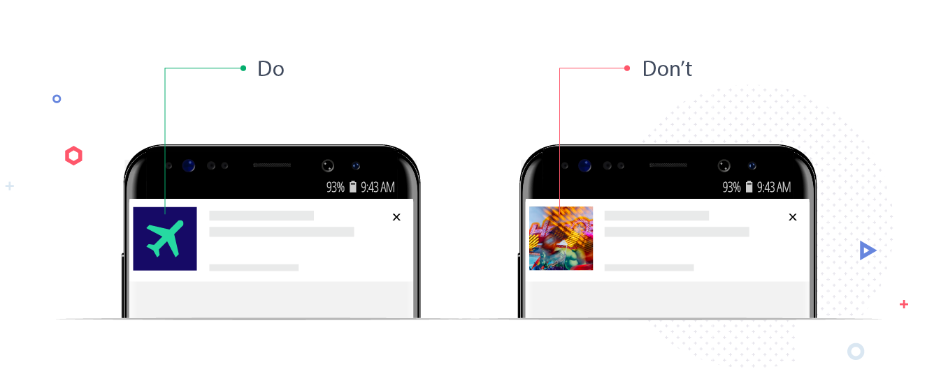
№1 — choose a simple and memorable image
The image size in push notifications is usually no more than 192×192 pixels. This is definitely not enough to reveal a complex, creative idea and show a lot of details, which arbitrage creatives often have. The more objects there are in a push notification image, the harder it is to understand, let alone remember.
Don’t confuse your audience. Attract attention with a simple, understandable, and memorable picture, icon, or logo.
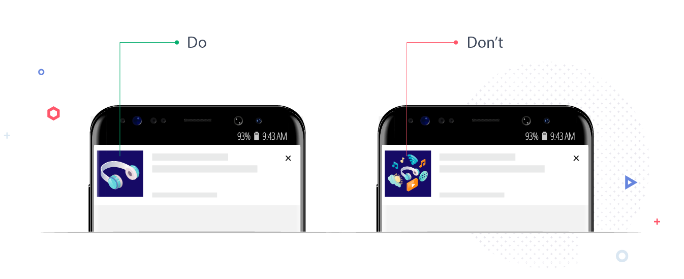
№2 — choose an icon instead of a photo
Developing the previous point, icons give better results than photographs of people, sophisticated graphics, or abstraction. The latter is what many affiliate marketers prefer to use.
A similar conclusion was reached by Servando Silva, one of the world’s largest media affiliate marketers. He wrote about this on the affLIFT forum: «Most often I use icons for push notifications, as they convert better than regular images because of the small size of the square».
Just do it so you can see and understand how much better icons work for you.
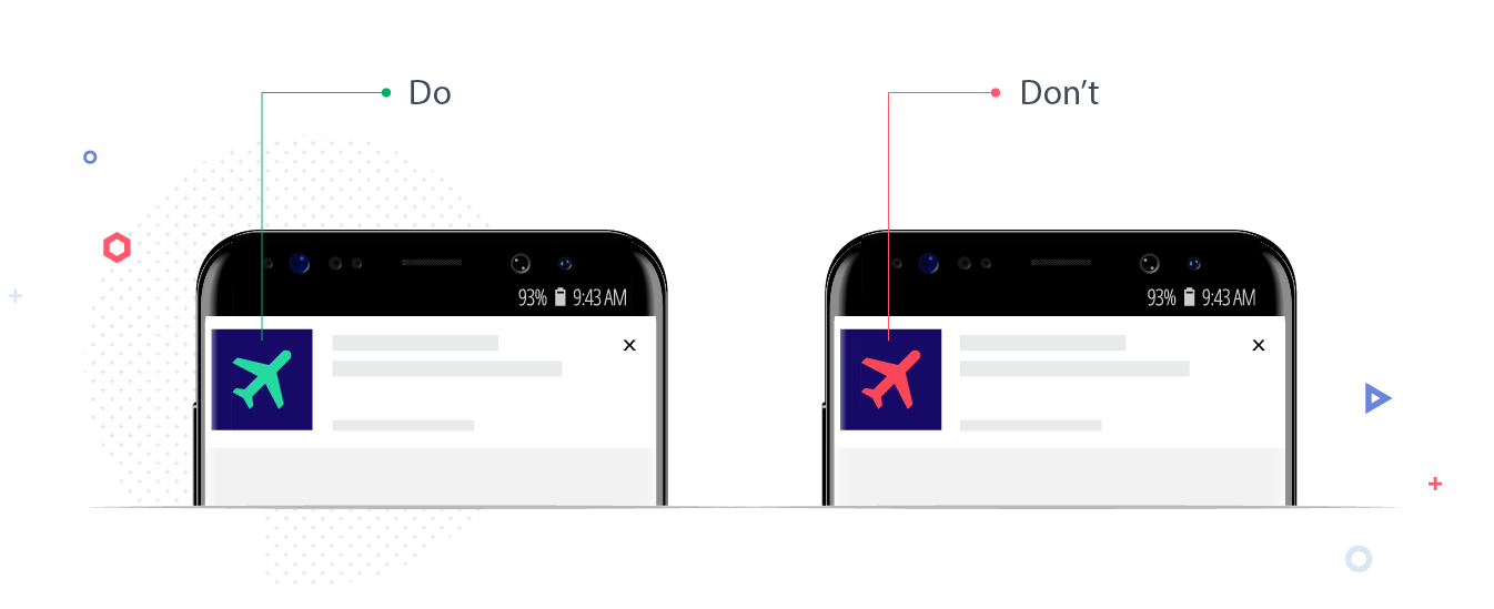
№3 — choose green instead of red
Another thing that many people use which doesn’t work is to use the color red. It is believed that red is the most eye-catching color and there is some truth to this. But let’s be objective, it’s not always appropriate. In fact, it’s often completely inappropriate.
There are many other colors to choose from. For example, green performed well in push notifications. Apparently while surfing the Internet, people want to feel relaxed and safe and not see the warnings that red symbolizes.
We also recommend testing how well black and white images work. These colors look good against the background of colorful and variegated competitors and, thanks to this contrast, they could be a more advantageous option.
№4 — discard text in the image
The size of a push ad is small and so we have found it is better not to use images with a lot of detail. It also means that you should keep the use of text to the absolute minimum.
First, there are two separate blocks for text in a push notification. Say whatever you need to say in words in these blocks — and don’t forget the call to action. Allow the image to fulfill its mission to be creative.
Adding extra text to an image may seem tempting, but don’t fall for it. Let’s emphasize again: choose the simplest (but at the same time the most noticeable) image for the push creative.
№5 — use an emoji or an emoticon
Communication on social networks is already impossible to imagine without emoticons and this trend is gradually moving to affiliate marketing.
An AdWeek study found that 92% of online consumers use emoticons. A survey commissioned by Harris Poll, ordered by GIF Tenor, found that 36% of millennials (aged 18 to 34) prefer to use GIFs and emojis rather than words to better communicate their thoughts and feelings.
Several other studies claim emoticons can increase CTR by up to 40%. Of course, a click isn’t a conversion yet, but increasing traffic is a good start.
When choosing emoticons for your ad campaign, make sure they are aligned with the offer.
According to the analysis by CleverTap, emoticons work best for these:
- business and finance;
- utilities;
- retail trade.
For example, business and finance-related apps that use emoticons in their push notifications get a 128% higher CTR.
Here are the three areas where emoticons perform badly:
- entertainment and activities;
- travel and hotels;
- health and fitness.
One would think that these industries would be suited to the use of emoticons, but this is not the case. However, you shouldn’t take this study as the last word.
Don’t be lazy, experiment with a lot of emoticons and decide if your RK needs them. The correct use of emoticons is an art you need to master.
№6 — show people what they want to see
Show your audience something that they cannot tear themselves away from.
For example, a recent study by Taboola found that G-rated images with adorable pets get 13% higher CTRs than images without animals. Of course, the use of animals in creatives is not the secret to arbitrage success, yet. They are not suitable for all verticals either, but you can use them.
Monitor all sorts of sites looking for an answer to the question of what Internet users want to see. We especially recommend Twitter because this is where most of the memes and socio-cultural trends come from. Try to be on the same wavelength as them, adjust, and understand your audience. You’ll find your push ads will be really cool.
Good luck!